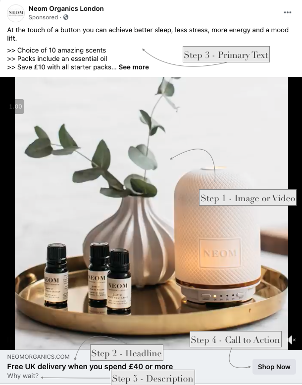
The anatomy of a high performing Ad
Ad Fab. What makes an Ad so fantastic?
How do you create the one that’s going to meet your ad objectives? I’m sharing some key learnings from working in Facebook Masterminds and with Ads clients to produce a post on the makings of a high performing ad.
Delving into five key areas of an A* Ad this guide can help you fine-tune your advertising. Which just leaves you to get it on its merry way to your customers.
The five areas in order of importance:
Image or video
Headline
Primary text
Call to action
Description
Step 1 - Images or Videos that ooze appeal
Choose images and videos that connect on a personal or emotional level. People relate to brands and humans who portray their visions or dreams of what they want to be using, doing or feeling. Keep in mind a diverse and inclusive set of images and video. Use an Ideal Customer filter and make sure they feel included and seen within your brand’s imagery or video.
Stock shots can feel quite bland if used in similar ways to other products or services. They might also pop up across a few feeds if it’s from a typically used asset library. Think about filters and angles of these so they fit in with your brand and will help to create a standout. The only way to avoid this duplication is if you have masses of budget for your own PhotoShoot. However, with the high turnover of Ad creative in Facebook Ads I'd suggest using that for product photography and personal portraits.
Always double-check the image. Does this make sense in the newsfeed? As people scroll, you want it to feel like it belongs within the feed. Also that it has enough gravitas to pop out and get the user to slow the scroll.
Ensure you have permission to use images, recognise artists and make sure usage is covered for the marketing channels you are using.
Use Customer’s testimonials. Either via User Generated Content (UGC). The customer creates a video talking about your amazing product or quote. Sharing how customers use items and feel about the brand builds trust and credibility. People like to see how it works in real life.
Step 2 - Headliners
The “Headline” copy sits after the image or video, the headline has the most impact on ad performance. There’s only room to squeeze in approximately 7 words, keep it brief. Get to the point with the benefits, and consider what the majority of your converting audience complete their purchase on. It’s a big ask of these seven words but I know you can do it.
Step 3 - Primary Text that converts £$:
Hook them. Be genuine. You’ve got the first three lines on Facebook and two lines on Instagram before they decide whether to expand or carry on scrolling. This “Primary Text” copy placement sits just above the image. It can be as long or as short as you want it to be: Think about these elements for your copy:
The offer - Be clear, what are you offering e.g 10% discount, free P&P,
Help solve their problem. understanding your customers’ typical problems or pain points allow you to showcase how you can help.
Keep the benefits upfront. You have a few seconds to get your customer interacting. You need to be upfront with how it will benefit them. You can follow with specific features but unpack those benefits first of all.
How do you convey your message? What tone do you use? Is it something that they feel comfortable with, and is it what they would use in their everyday language. Social allows you to have fun. If it fits with your brand tone and product then showcasing your brand personality can land very well with future and loyal customers.
Step 4 - Customers assemble.
The “Call to Action” button encourages the audience to tap and visit your website or lead magnet.
Think about the action you want your customer to do, consider the audience’s mindset at the time they’ve seen your ad. Is it brand new messaging, are they familiar with your brand, do you need to build more trust? Facebook provides pre devised CTAs but can range from the following, dependent on the goal you’ve chosen in Ads Manager:
Think about the action you want your customer to do, consider the audience’s mindset at the time they’ve seen your ad. Is it brand new messaging, are they familiar with your brand, do you need to build more trust? Facebook provides pre devised CTAs but can range from the following, dependent on the goal you’ve chosen in Ads Manager:
Step 5 - Supporting Description copy
The “Description” copy sits underneath the headline and is not shown on all placements. It means it’s sometimes only seen on Desktop newsfeed or Mobile newsfeed depending on headline length. Facebook says “The description will be shown to the user if it is likely to resonate with the person seeing it.” Usually around 6-8 words.
Testing, testing - Rinse and repeat
So now you’ve got the basics to create a showstopper. Depending on your budget levels, I would test, review and test again. Look at various formats, copy lengths, brand tone of voice within copy placements. What is resonating with your brand? Changing one element will allow you to work out which ad works best for your audience and which one will create the most sales or leads depending on what you’re looking to get out of your advertising.
If you would like any help getting your Ads going or putting together an Ad campaign. Contact me for a power hour. amy@jamjama.com
Sources: www.facebook.com, www.adspresso.com


